提示词
Create an award-winning 9:16 vertical advertising poster for IKEA. The design must feel clever, elegant, Scandinavian, and visually surprising. It should look like a globally recognized creative campaign built around a smart idea rather than a normal furniture ad.

Creative concept:
A single giant flat IKEA-style package stands vertically in the center of the poster. The package is partially open, and from inside it an entire Scandinavian home unfolds outward like an engineered paper world. A sofa, floor lamp, bookshelf, coffee table, rug, indoor plant, wall art, and small decor items emerge in a neat, controlled unfolding sequence. The room appears to bloom from the flat package like practical magic. The pieces still retain subtle fold-lines and flatpack logic, so the visual feels both believable and surprising.

Main visual:
A clean, beautiful IKEA box in the center, slightly open, with a fully formed but still partially folded living space emerging from it in three dimensions. The furniture should feel stylish, warm, and distinctly Scandinavian. The unfolding action must look elegant, not chaotic. It should feel like smart design compressed into a single simple package.

Background:
Bright, airy, minimal Scandinavian space with lots of clean negative space. Soft daylight, pale wood flooring, and a calm atmosphere. The background should not distract - it should support the idea.

Color palette:
Soft white, pale wood, light gray, muted blue, beige, warm natural textures.

Typography:
Render all text cleanly and beautifully, with modern Scandinavian simplicity.
Main headline:
"OPEN A HOME"
Product title:
"IKEA"
Subheadline:
"Good living, packed smarter."
Feature callouts:
- "Scandinavian Simplicity"
- "Flatpack Ingenuity"
- "Space-Smart Living"
- "Designed for Real Homes"
CTA:
"Unfold better living"
Footer line:
"Less complexity. More home."

Layout:
The IKEA box should be the central hero, occupying the middle of the poster. The unfolding room should expand outward and upward in an elegant radial flow. The headline should sit at the top in strong but simple typography. Product name and callouts should be neatly arranged at the lower section. The full composition should feel balanced, intelligent, and effortlessly stylish.

Style:
Hyper-realistic interior advertising, Scandinavian minimalist design, paper-engineering illusion, premium commercial art direction, soft daylight realism, clean editorial layout, fresh and visually smart, high-end poster quality.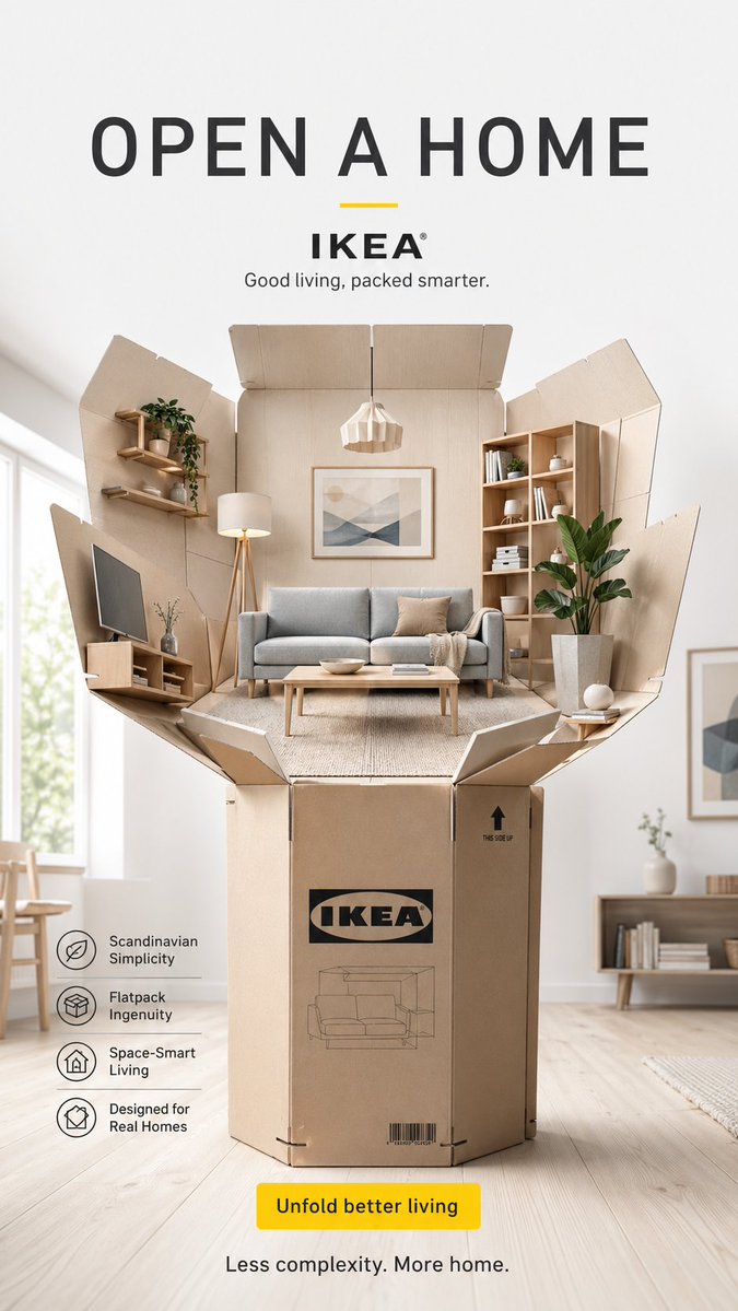
来源
@ertanlabs
作者: ertanlabs